Case study
Building a Living Design System from Day Zero

Client
Confidential wellness platform
Timeline
Shipped v1 in 3 weeks
Role
Co-Lead (solo initially)
Contraints
NDA bound, no prior system, tight roadmap
Setting the scene
scene 01 – joining the dots
In May 2023, I joined a wellness tech company as the second senior designer in a small product team. Just 20 days before, my co-lead had joined and together we noticed design was all over the place. Layouts clashed, elements lacked logic, and the app felt stitched together.
I grabbed my Notepad and began sketching the IA to make sense of things. A few KT sessions later, the problem was obvious. UX was scattered and UI was worse. The product had no design backbone. We had to fix it.
Spotting the problem
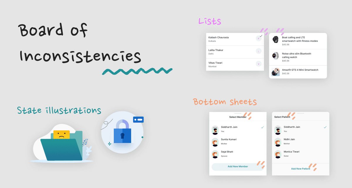
scene 02 - auditing the chaos
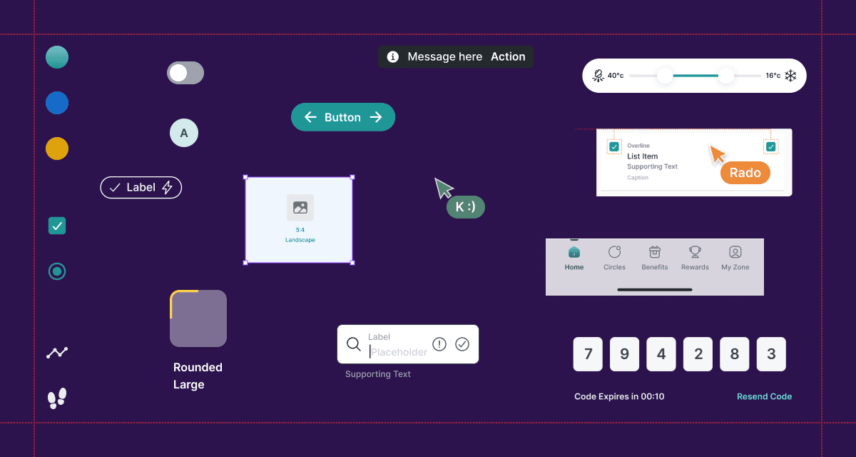
We skimmed the product to build a visual audit. In just a few hours, we found:
Inconsistent button types and shadows
Typography without hierarchy
Random spacing across screens
A bloated, unfocused color palette
This wasn’t just about design hygiene. It was slowing down everyone. We grouped repeated patterns and mapped a rough component list to show the cost of rework.
Pitching the solution
scene 03 - making the case
We built a deck for product and engineering:
Audit highlights and visual inconsistencies
Impact on UX, dev time and product quality
Benefits of introducing a design system
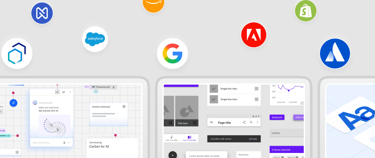
Examples like Material, Carbon and Atlassian
We were new, and it was a bold move. But the ask made sense. This wasn’t about perfection. It was about scale. We got the go-ahead.
Building the core
scene 04 - laying the groundwork
We started with the basics:
Typography: A flexible type scale
Colors: Functional tokens and semantic logic
Icons: One unified set
Spacing & grid: 4pt system, clean layout columns
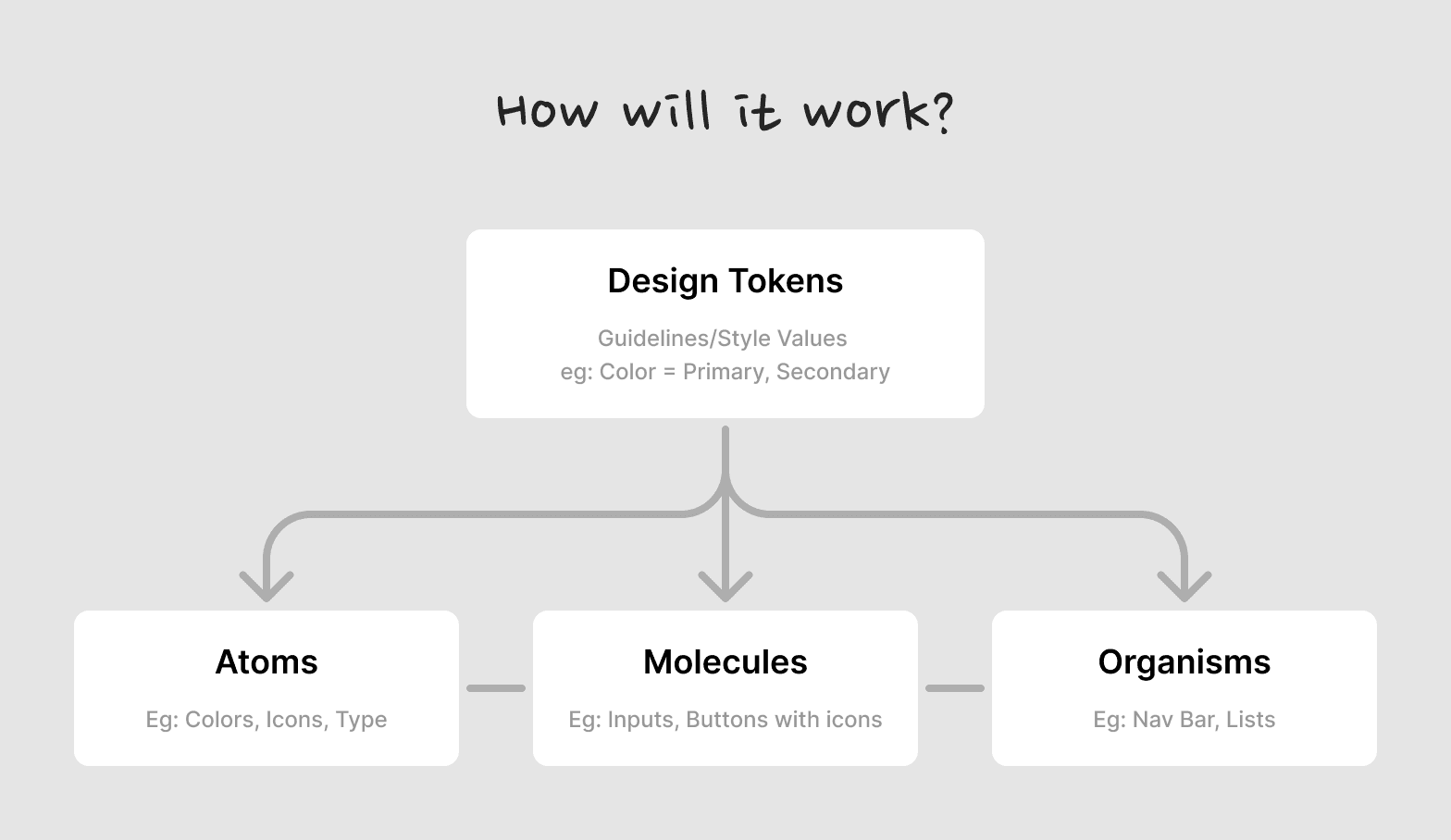
scene 05 - scaling the system
We built from atoms to organisms:
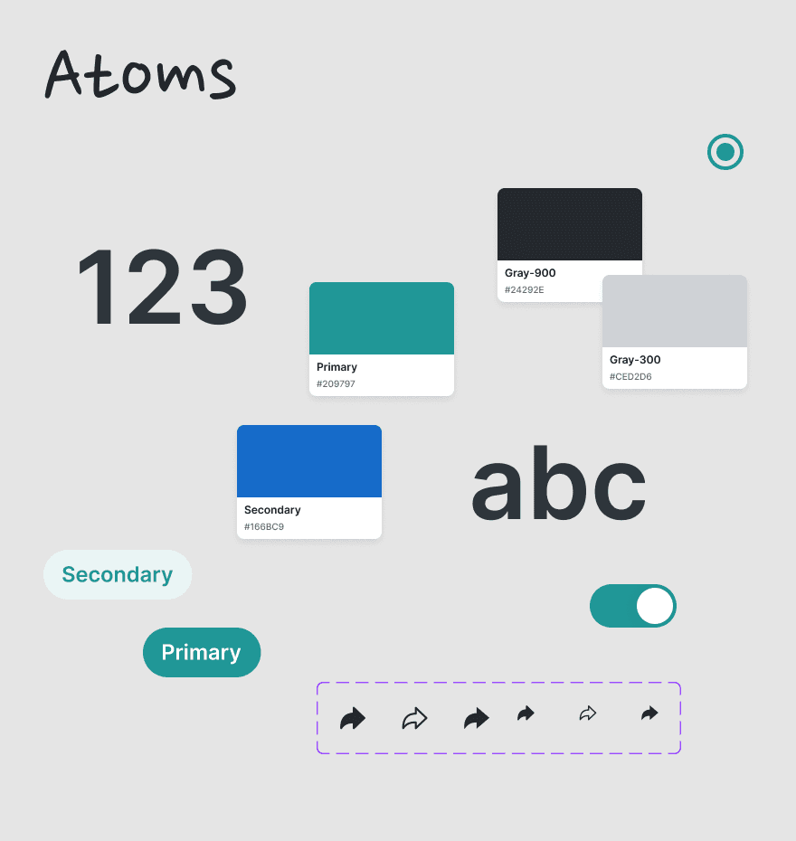
Atoms: Buttons, inputs, toggles
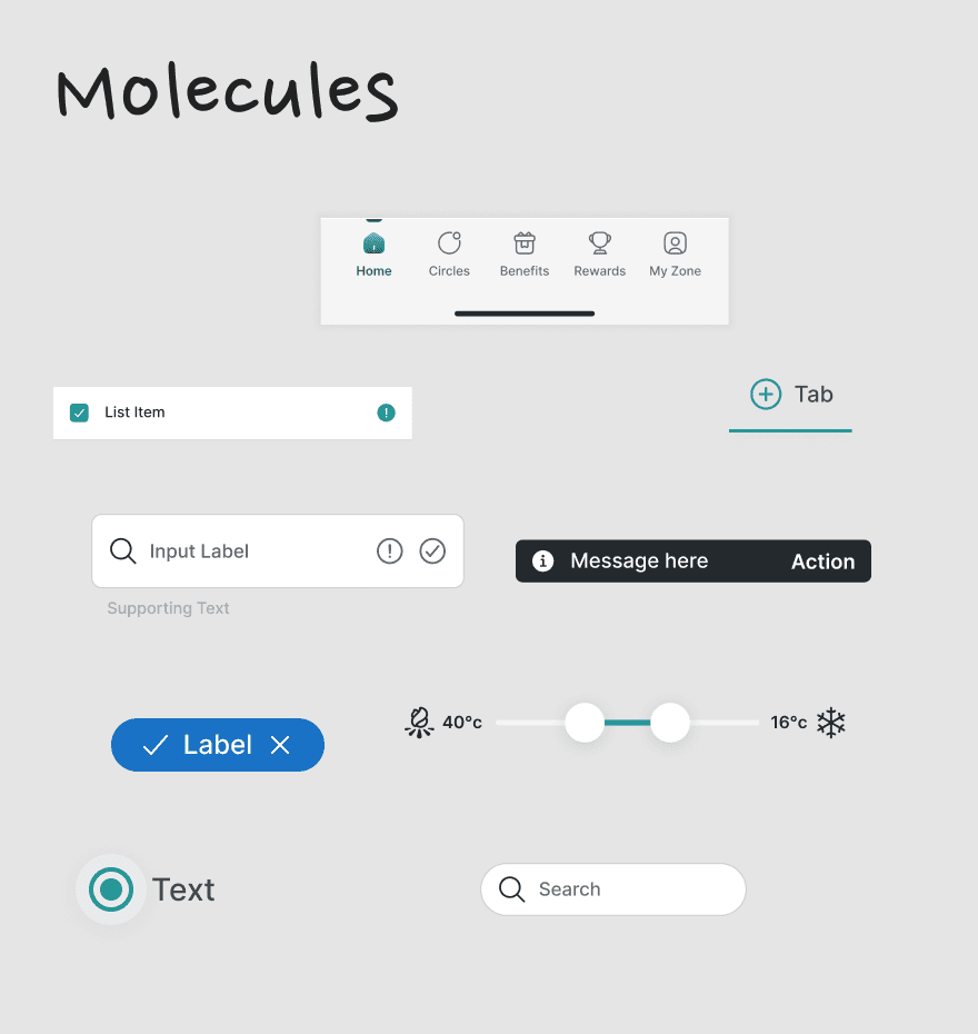
Molecules: Cards, form fields
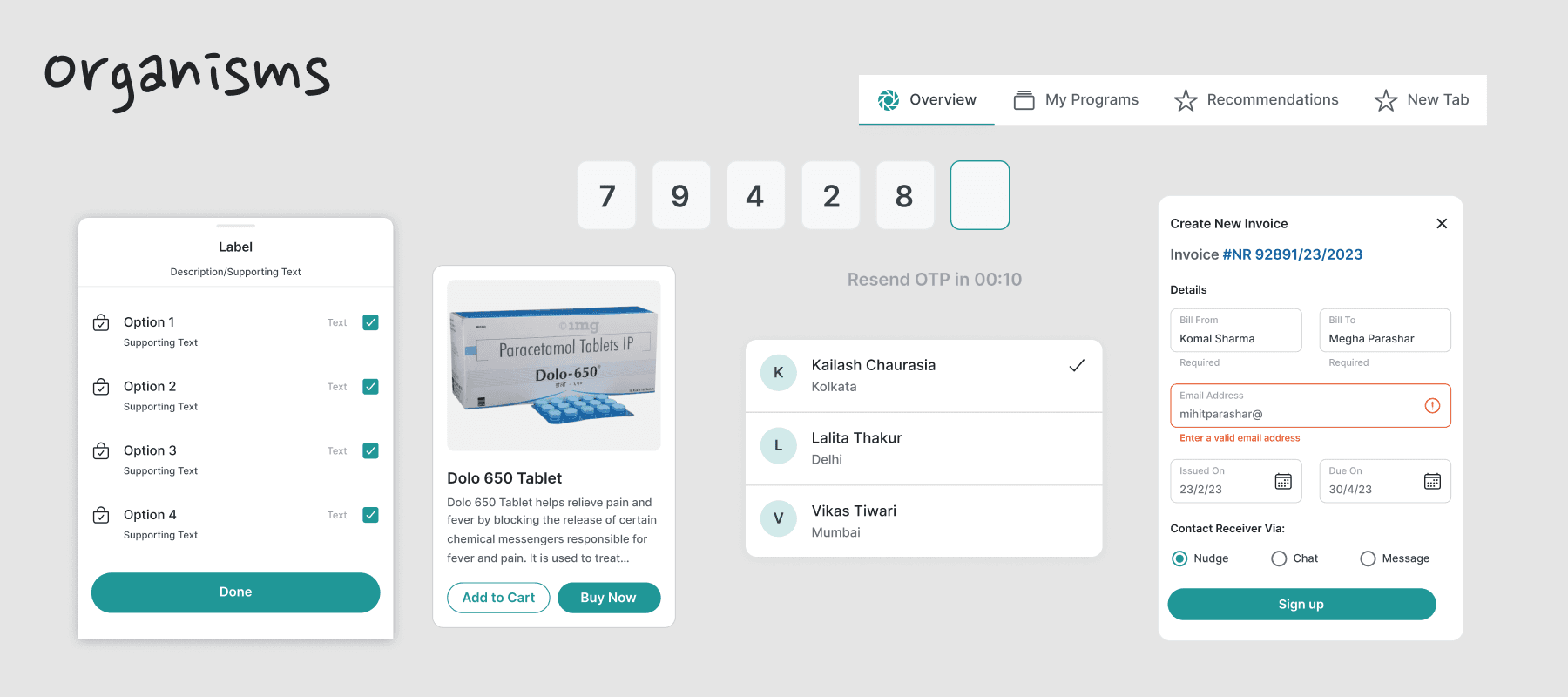
Organisms: Nav bars, tabs, modals
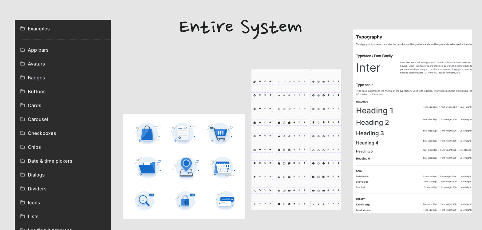
Every component had naming, use cases and variants. We documented everything in Figma for dev handoff and scaling.
Building trust
scene 06 - launching v1
In 3 weeks, we shipped v1:
Shared design library in Figma
Weekly syncs with devs
Tokens ready for frontend
Notion doc as system reference
Designers started contributing. Devs shipped faster. Mocks turned into builds without back and forth. The system added speed and structure.
Looking back
scene 07 - from 2 to 4+ years
I had just 2 years of experience when I co-led this. It was my first time owning a system end-to-end. Now, with 4+ years behind me, I still carry the lessons:
Create clarity from clutter
Lead change without a title
Align deeply with tech
stage 01
stage 02
stage 03
stage 04
stage 05
stage 06